When the Bottom Half Becomes a Line
When the Bottom Half Becomes a Line
When the Bottom Half Becomes a Line
Do people really look at a chart like this and think capitalism does not produce a divide?

Wealth Distribution
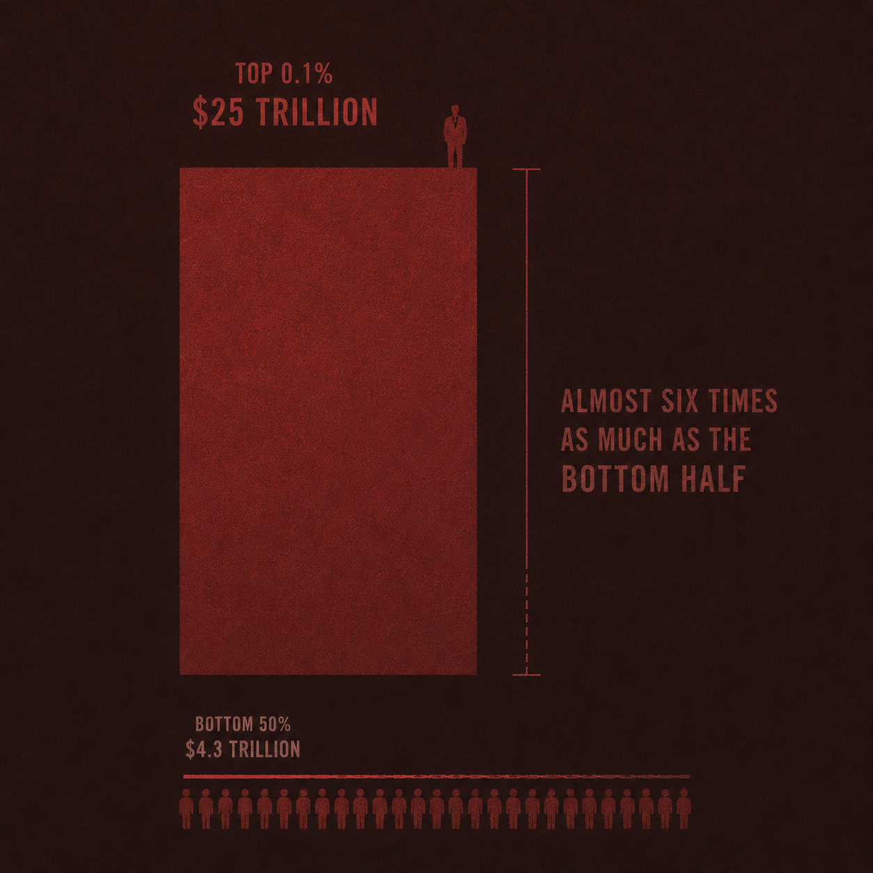
The Federal Reserve chart shows household wealth in the United States by wealth percentile group. By the first quarter of 2026, the top 0.1% held about $25.1 trillion in net wealth. The next 0.9% held about $30.0 trillion. The next 9% held about $63.2 trillion.
The middle 40% held about $51.5 trillion. The bottom 50% held about $4.3 trillion. The data comes from the Federal Reserve’s Distributional Financial Accounts, which combine the Financial Accounts of the United States with the Survey of Consumer Finances. (FRED)
The first thing one notices is visual. The bottom half is almost gone.
That is not a trick of presentation. The chart is showing levels of wealth, so the line disappears because the underlying claim is so small. The bottom half of American households owns only a narrow strip of the national balance sheet. The richest 0.1% alone owns almost six times as much wealth as the entire bottom half.
This is not only a story about poverty. It is a story about ownership.
Capitalism often defends itself through growth. It points to larger markets, larger firms, larger houses, larger pension funds, larger indexes, and larger national wealth. It says the country became richer. That is true. But growth does not settle the political question. The political question is who owns the growth once the system has produced it.
The answer is visible in the stack.
The people at the top do not merely earn more. They own more of the assets through which future claims are made. They own more equities, businesses, property, financial assets, and income streams. Their wealth does not only sit there. It compounds. It gives them collateral, time, influence, protection, and room to move.
The bottom half lives much closer to wages, rent, debt, transport costs, childcare, medical bills, food prices, and the cost of shelter. It may work inside a growing economy and still fail to accumulate a meaningful share of what that economy produces. It may carry the system through labour and consumption, but it does not own much of the system’s future.
This is where the divide becomes political.
A society can tolerate inequality when people believe movement remains possible. It can tolerate hierarchy when the bottom does not feel locked out of the basic bargain. But when half the households in a wealthy country can barely be seen in the national balance sheet, the bargain changes. Growth keeps happening, but it no longer carries the same social meaning. It happens above people, around people, and through assets they do not own.
That creates pressure.
People may not describe this in the language of wealth percentiles. They may speak about rent, groceries, debt, jobs, bills, schools, healthcare, and the feeling that no amount of work creates stability. But beneath those complaints sits the same structure. A small group owns a large share of the claims. A large group owns almost none.
The instability does not come from envy. It comes from the lived knowledge that the system can expand while leaving half the country with a narrow claim on expansion. It comes from watching wealth rise without security following it. It comes from being told that the economy is growing while the terms of ordinary life keep tightening.
The chart does not prove every argument against capitalism. It does something more precise. It shows what a capitalist society can look like after decades of asset growth when ownership is allowed to concentrate.
It shows a country becoming richer while the bottom half becomes a line.
Source note: Federal Reserve, Distribution of Household Wealth in the U.S. since 1989; Distributional Financial Accounts, based on the Survey of Consumer Finances and the Financial Accounts of the United States.